For the last month, my whiteboard has been staring at me accusingly. Now I need it, so before wiping it clean, I need to describe an idea I have for spatial hypertext.
You may begin this post in a number of ways:
The Inspiration | The Theory | Relations to other software | The Idea Itself
Last semester, I did extensive research on the flow of wit and rhetoric in the metaphysical poetry of Donne, Cowley, Crashaw, Herbert, and others. The test case for my theories doesn't even show up in the paper, because it would take too long (for my length requirements) to unravel using conventional text. But "On Hope," by Crashaw and Cowley, was the poem that opened it all up for me.
To properly study this poem, I needed a way to record links between bits of text. I also needed to show them. I had hoped to use Tinderbox, but it's difficult to link two specific bits of text to each other within a Tinderbox note. It can be done, but it's awkward and cannot be visualized very well. So I looked elsewhere. The closest matches were pieces of experimental hypertext software from the Xanadu project: a Udanax derivative called Abora and CosmicBook. After working with Abora for a time, it was clear that link-making is much less important to the software than version tracking. The link interface is very unintuitive. CosmicBook also turned up a dead end; there is no authoring tool.
I looked at Visual Knowledge Builder. But this, for my purposes, proved even less useful than Tinderbox.
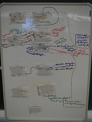
I finally settled for a small whiteboard. In order to simulate my hypertext musings, I cut the poem into pieces, taped the pieces fo the whiteboard, and drew lines between them. This approach was very helpful.
My paper, which was submitted to the Norton Scholar's Prize (crosses fingers; although probability of a prize is low), uses the Dia flowchart software to demonstrate my ideas.
The Inspiration | The Theory | Relations to other software | The Idea Itself
During the work for the paper I submitted to Hypertext 2005, I began thinking of the spatial hypertext map as a single hypertext space. This idea was encouraged by Shipman, Marshall, and Moran's research into implicit structure in Spatial Hypertext (which is why I am very grateful to the Visual Knowledge Builder/VIKI team for lots of cool ideas). I realized that Tinderbox aliases, which carry the same properties as regular text notes but keep unique location and links, are the spatial hypertext equivalent of transclusions. Of course, they are a very rough version of transclusions, if you think of the spatial document area as a collection of individual nodes. Since it's impossible to spatially transclude a portion of the note, the tool may seem to have few uses.
The idea of aliases as transclusions was not the central revelation here. Rather, the key change in my mind was the concept of the spatial map as a document space rather than a separate, flowchart view of document information.
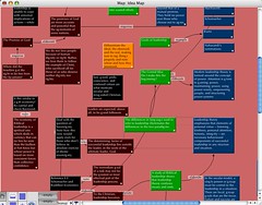
Credit Where Credit is DueThis concept of the 2d spatial hypertext as a document space is not new. Jeff Raskin's ZoomWorld, Visual Knowledge Builder, and the Fenfire Project (screenshot) all share this concept. It can even be done in Tinderbox (as you see through this screenshot of a personal brainstorming session), though it's probably not an official feature:
Notice that my Tinderbox map is a similar equivalent to what I was doing on the whiteboard. Notice some of the limitations. For example, there is a limit to the amount of text you can place in a box, since it is the title. Notice also that notes can link only to other notes, not to text within other notes. This is because Tinderbox is displaying the titles, not the text, and because Tinderbox does not display the text of the note within the spatial view.
The Inspiration | The Theory | Relations to other software | The Idea Itself
The IdeaThe idea is described in terms of Eastgate's Tinderbox, since it is the software with which I am most familiar. It would work somewhat like CosmicBook.
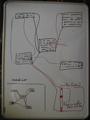
First, a shot of the whiteboard:
(note: Visual Knowledge Builder already displays the text of the note in the spatial map. However, it doesn't show link lines between the actual bits of text)
Each of these boxes displays the text of the note, and the size of the text display area is determined by the user-set size of the box on the screen. Thus, as the user zooms, more text can become visible (or the text could get bigger, depending on user setting, I suppose).
Personally, I would implement this feature as part of the Zoom in Tinderbox maps. Once you zoom to a certain level, it might make the text of the note visible. Alternately, a separate view might be used. The ability to see the fulltext of the note in a spatial view provides great usefulness when mind-mapping a set of ideas. One can do more than visually connect a set of titles; one can connect a set of texts.
Once you have implemented this, it becomes very useful to store and show the links properly. To do this well, Tinderbox would have to include selection->selection links. The linking interface would be simple. Highlight an area of text in one note. Then highlight an area of text in another note. Draw the link. Other interface issues could be solved using a link-selection system similar to Tinderbox's current dropdown that helps users work with overlapping links.
(random thought: the intelligent use of links and link types in Tinderbox is one of the least explored concepts, and unless I am mistaken, one of the most difficult to undertake without resorting to the XML)
Internally, this could be a problem. We run into the limitation of XML pretty quickly, since overlapping tags are not allowed. This is why Tinderbox stores links at the end of the Note's XML rather than using delimiting tags. In fact, it is this limitation of XML that makes Tinderbox's link-editing a little sketchy sometimes. But it can be done. Since Tinderbox works reasonably well with overlapping link origins, a similar solution may probably be devised for overlapping link targets.
Once you have implemented text-to-text links, you need a way of showing them. The previous diagram shows a way that visible text may connect to lines. This much is not a new idea. Simply connect the line to a highlighted portion, although I might suggest an outlined portion. Perhaps the link lines should not extend into the document until a key-combination is pressed or a preference set, since there are times when you don't want to give links undue visual importance. This would be similar to a current Tinderbox option in which command+option is used to show and activate a link if a certain option is set in the preferences.
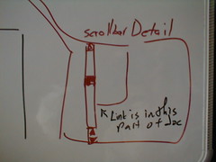
Another type of link does not extend into the document text: links to text which is currently out of the viewing window. CosmicBook hides these. This is not a good idea. I had two ideas, both of which are shown in the previous figure. One idea is to show whether the link is to someplace previous or later in the document by drawing the line up to the top or bottom corner. This is a rough way to do it, but it would work.
The other way, shown here, draws a line to the part of the scrollbar where the linked text resides.
This latter approach creates a number of UI difficulties. While it shows the relative position of links outside of the current viewing, it can completely muddle the intelligible display of the relative position of lines that link to text within the viewing window. Links to active parts of the document could not link to a different side of the box, since that would be a nightmare of re-draws once the user started scrolling. Links to text inside of the viewing window would have to pass through the little scroll box that represents the current viewing window. This would make it difficult to distinguish the individual link lines if the active viewing window contained a large number of links.
What does this have to do with aliases?
If spatial hypertext were used, it would be simple and obvious to make text-to-text links from a note to itself. Since aliases retain their own set of links, it would be possible even to make several sets of text-to-text links within the same text. The editing code might be a bit tricky, but a great user interface problem would be solved. To visually show text-to-text links within the same text, merely bring an alias of the note alongside the main instance of the note (or another alias). The link lines would be drawn as if they were separate notes. Since aliases have their own unique set of links, there would be no problem with duplicate link lines. Lines would proceed from their origin to their destination.
Implementation
This is just a rough idea, and it would take careful frontend and backend brainstorming, testing, and other woodshedding to be turned into actual software. Eastgate is currently working on a Windows version and is facing new challenges with a codebase that uses different APIs for the canvas. Even if they were to like the idea, I don't know if this fine level of drawing control is available to them without considerable bits of extra code. It might not be possible outside of a more fundamental canvas system, or something like Flash and SVG. But I do think that these ideas may make a useful companion to spatial hypertext ideas and merge spatial hypertext with more traditional thinking on hypertext systems.
The variable issues in programming are so many and the idea so unconventional to basic canvas systems, I'm uncertain how long it would take to put something like this together. And there are other issues. For example, how would Tinderbox show containers in such a view (dimmed backgrounds showing boxes? Or switch between?)?
What do you think? Email me.
The Inspiration | The Theory | Relations to other software | The Idea Itself


