Meetings, meetings.
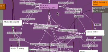
And then I began to write. After a few hours, my efforts began to look like spaghetti.
Last week, I began with an organized Tinderbox Map View of the main areas of the site. Pages were organized in circles around a central set of links. Everything looked nice. Academic majors were one diagram. Minors were another area, and departments were another area. This division couldn't last long. I wasn't hired to make nice-looking diagrams. I was hired to write thoroughly, thoughtfully interlinked content.
I'm writing by department. The people in academic departments form the core part of an academic institution. Nothing happens without some link to them. For marketing reasons, viewers will first be directed toward majors, but the content's internal structure will funnel them toward departments.
When I write, I first annotate a department's existing pamphlets, catalogs, and news releases. Then I open the Tinderbox file and drag all the department-related pages in front of an adornment for that department. I begin to write, and the pieces begin to connect.

Each department has unique challenges. In the case of the Fine and Performing Arts department, three somewhat disconnected areas must come together: art, theatre, and music. Art and theatre feature only a major and a minor. But music posed some challenges: three majors and one minor. Later on, the biology and chemistry departments will pose another challenge. I will have to heavly interlink them, since biotech, biochemistry, and environmental science draw heavily from both departments.
By using Tinderbox, I am not constrained by common hierarchical ideas. Neither am I distracted by the designers' layouts. For example, I realized that all three music majors share the same basic features. But there is no central Music Department page to place content. I considered packing the general Music Major page with everything. But this wouldn't reflect the college well. The basic music major is the least emphasized music major. I also realized that a full list of the co-curricular opportunities available to music majors would clutter the Fine and Performing Arts page.
To solve this, I created a new, music landing page (visible if you follow the screenshot thumbnail link). Unlike a department page (it won't list faculty, etc) it contains information common to all music majors and minors. Now, the Music Therapy Major, Music Education Major, and Music Major links point to the landing page, which directs viewers to their desired focus and displays basic information about music at Elizabethtown.
This is a natural solution. Had I thought hierarchically, I would have by habit broken FAPA into three sub-departments: art, theatre, and music. But this wouldn't accurately portray the college. A tree-like model would have been unable to represent the truth. Tinderbox freed my mind to think more clearly about my task, for it is flexible enough to fit the nature of naturally-structured information.

