I like diagrams. If I ever had an addiction, it would be whiteboards.
When I first came into my current job, they offered me a new laptop.
Initially, I turned down the laptop. I requested a set of whiteboards instead.
I have an insane stack of crisp, new legal pads in my room.
I have an even more insane stack of full legal pads in my files.
Visual organization of information is important to me. This is probably why I post photos, letters, advertisements, postcards, and comic strips onto my walls.
I like Tinderbox because it lets me think about my information heirarchically, linearly, and visually. But why is Tinderbox any different than the flowcharting software I used to love using?
Flowcharting tools usually require me to understand my ideas before laying them out. They work well for structures, hierarchies, and simple relationships. But they're primarily for designing pretty pictures to show the boss, or diagrams to help explain a concept. If something can easily be grasped by a quick glance at lines and boxes, flowcharts are perfect.
Tinderbox doesn't just map ideas. My Tinderbox files don't just represent information.
My Tinderbox files are the information. And whatever form the information takes, Tinderbox follows.
It's like the old show and tell writing truism. As representation models, flowcharts tell you what the data is like. As an authoring tool and data repository, Tinderbox shows it to you.
Case in point: my current project.
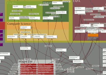
After entering over a hundred pages of information and links, my Tinderbox file looked very daunting.

(click for a closeup of all the lines)
As the author of the file, I knew what was going on. I understood the lines because I made them. Everybody else balked at the complexity. My boss was impressed, not because it made things clear, but because it made me look smart.
I hate looking smart because my work is complex.
Had I used a flowchart, I would have been tempted to think out my structure before drawing my flowchart. Here, I just filled in the information and waited to see what would happen.
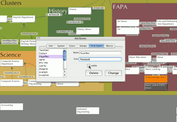
Unlike HTML, Tinderbox uses link types. These link types work as labels and allow me to browse the information in interesting ways. But I was very excited to find out how customizable link types were, to find out that I could hide certain link types and highlight others.

(click for a closeup of the link types dialog in action)
By hiding some link types and making others more visible, I was able to analyze and discover the natural structure of the website content.
I'm glad I did this, since the structure came out differently than I expected.
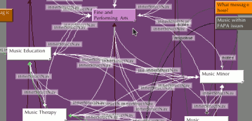
When I focused in on the Fine and Performing Arts Department, I realized that I needed a new page to make the navigation simple. By adding the "Music Landing" page, I broke the conventions of rigid structure, but I kept information from being duplicated and users from being confused. A tree isn't always the easiest, simplest way.
 (click for a closeup of the FAPA structure)
When the time came to start putting together the site's content in the third-party CMS software, I just had to copy-n-paste from Tinderbox. For once, life was simple.
When I finally present the new website to college administration and faculty, I'm not going to show them Tinderbox. To be honest, they don't need to see the complexity of the site. Instead I'll use fancy flowcharting to show how all my complex Tinderbox footwork makes the new website intuitive, simple, and easy to use.

